


Case study — Shopify
Build Your Aashirs Box
How we turned a fixed bundle page for an Indian jewellery brand into a guided box-building experience — on mobile first.
- Client
- Aashirs
- Platform
- Shopify
- Period
- August–September 2026
- Our role
- Designed and developed the bundle-building experience and related website improvements
Fixed sets were limiting choice
Aashirs' customers shop mostly on phones, and in jewellery the purchase drivers are perceived value and savings. The old page offered only fixed product sets — customers felt told what to buy — and every page had to feel premium and on-brand, not templated.
The goal: let shoppers build their own 3, 5, or 7-piece box with clear pricing and savings, so a larger, considered purchase feels confident.
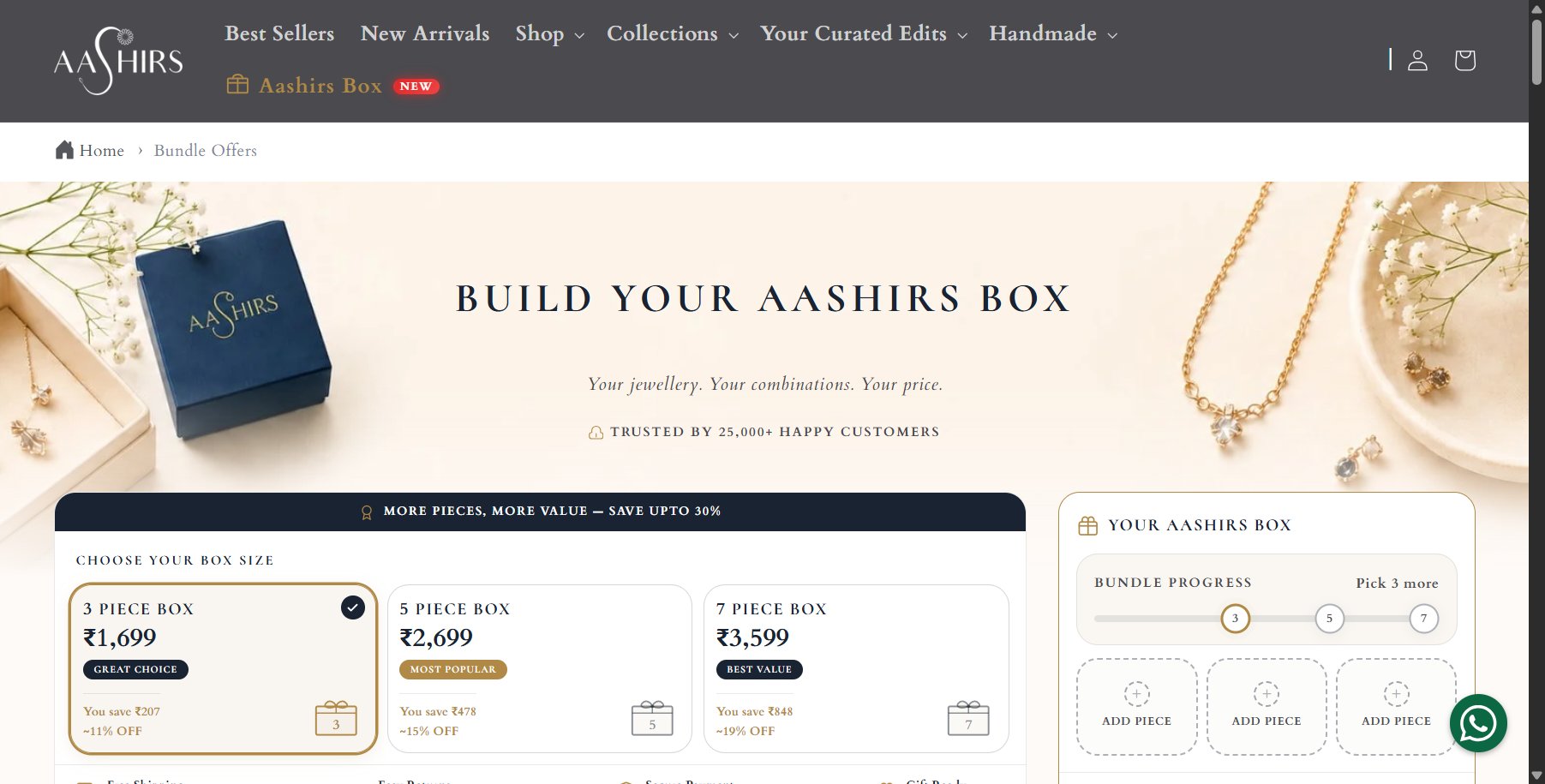
A guided journey, not a product grid
We designed the page around four steps, and rebuilt everything to serve them:
- Choose a box size
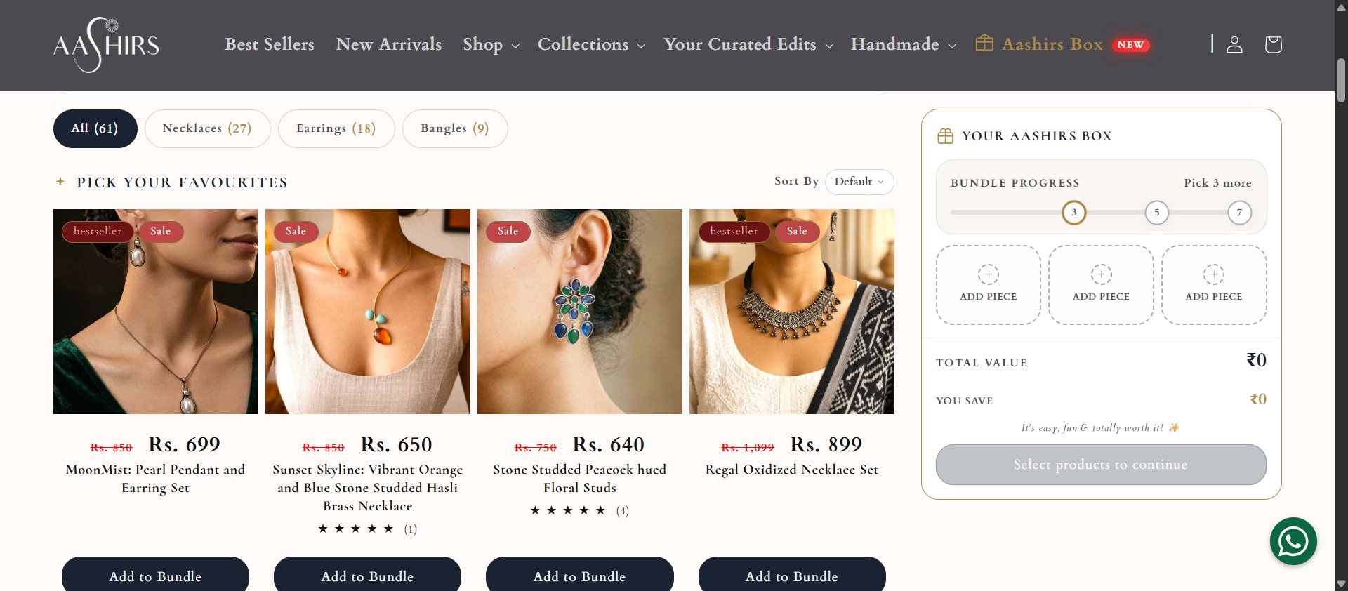
- Pick favourite jewellery pieces
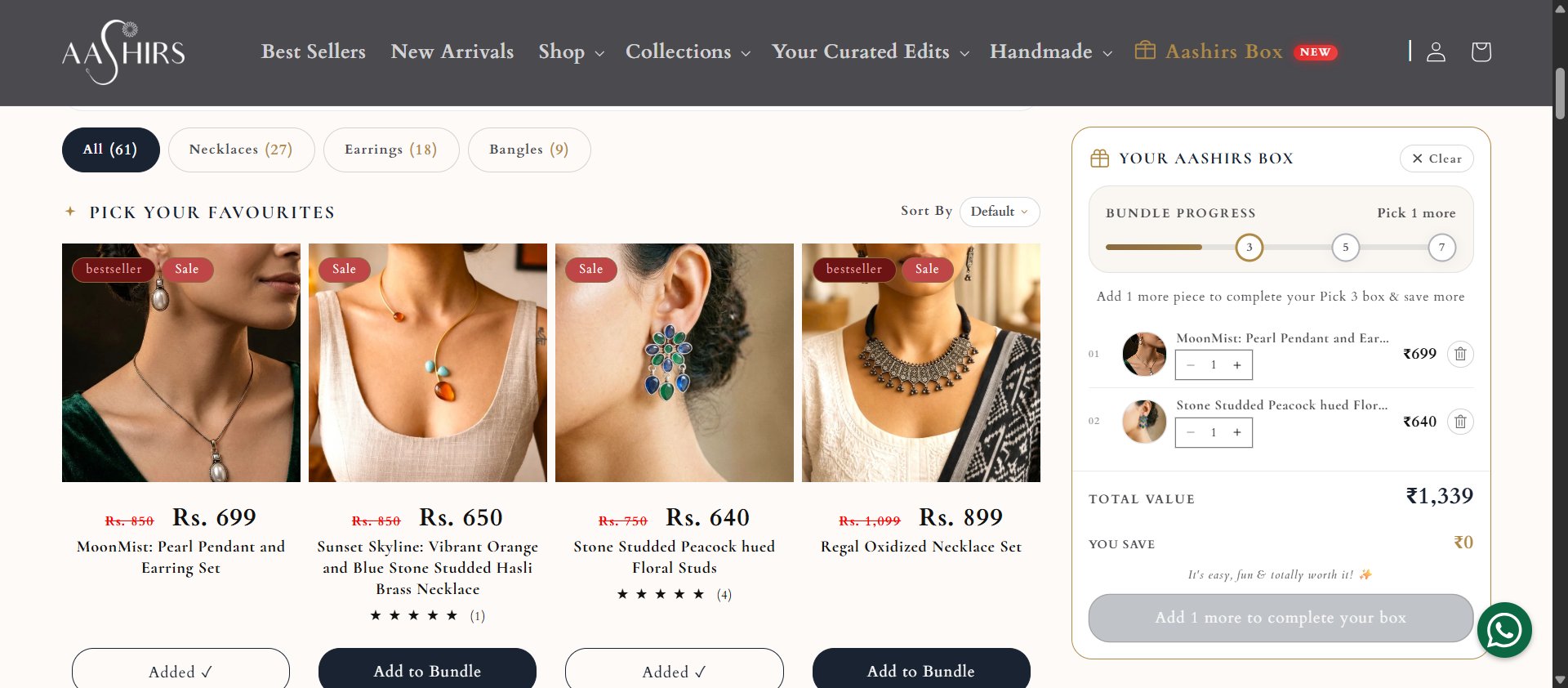
- Review the box
- Continue to checkout
Every step, rebuilt
A clearer bundle offer
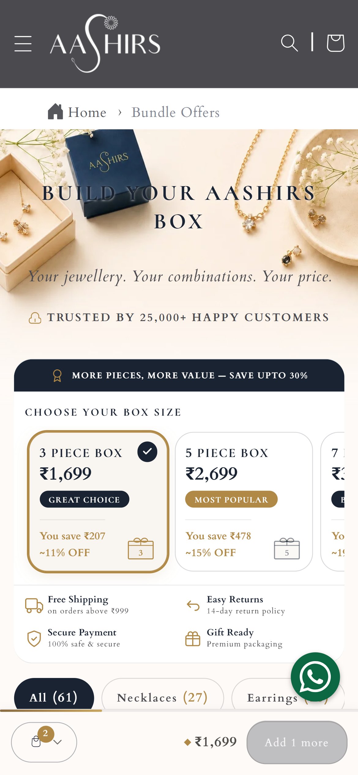
Three options — pick 3, 5, or 7 pieces — each showing price, tagline, and estimated savings, so customers compare without doing the math.
A more premium page
Stronger hero, brand-focused copy, trust signals, and a warmer layout. A dedicated Aashirs experience, not a generic bundle template.
Easier browsing
Shop by category — necklaces, earrings, bangles — with sorting by price or name, instead of one overwhelming list.
A live box summary
Selected pieces, current value, bundle price, savings, and pieces still needed — visible at every step, on desktop and mobile.
Quantity and removal controls
Increase, decrease, or remove pieces at will. The selection stays visible, so shoppers always know what they are buying.
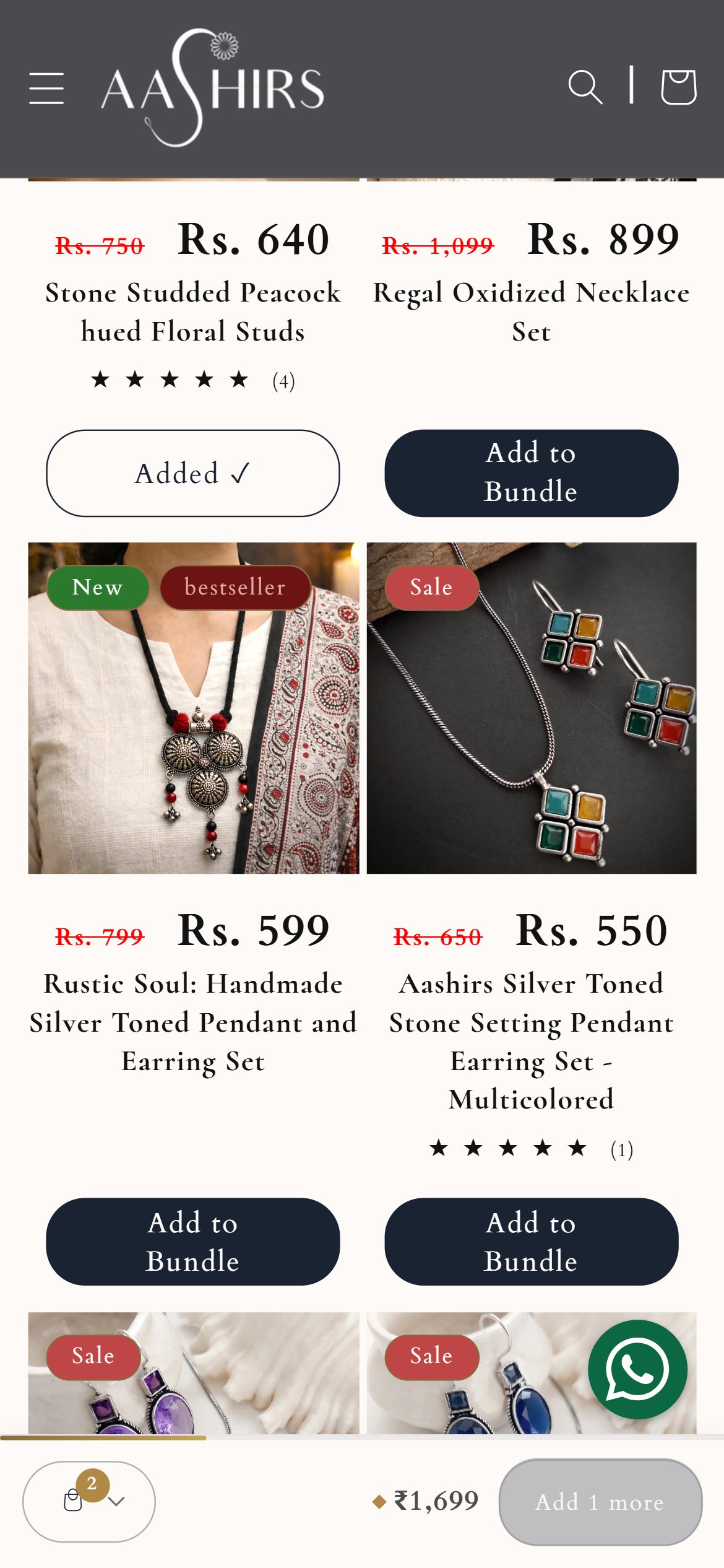
Mobile-first summary
A persistent mobile summary bar with piece count and price; tap to open the full box in a bottom panel. Built for how customers actually shop.
Sold-out handling
Unavailable products are marked, cannot be added, and sit behind available ones — no dead ends at checkout.
Smoother checkout
One action adds the whole box to the cart, flowing into the store checkout (including GoKwik) as a continuation, not a detour.
Beyond the page
The bundle page doesn't live alone, so the surrounding store got attention too:
- Clearer Aashirs Box link in the main navigation
- Mobile layout and spacing improvements
- WhatsApp button adjusted so it never covers bundle controls
- Leaner product and collection templates
- More efficient image loading
- Better search-engine metadata
- Third-party script reliability fixes
What changed for shoppers
Faster, clearer decisions
Price, value, and savings visible at every step — no mental math.
More confident purchases
Live progress and a clear summary cut the uncertainty that kills boxes.
Mobile-first, for real
Persistent summary bar and bottom panel match how most customers shop.
Fewer dead ends
Sold-out handling, remove controls, and one-step cart addition remove abandonment friction.
Consistent premium brand
The page feels like Aashirs throughout, which is what a jewellery purchase needs.
A stronger foundation
Navigation, images, metadata, and script fixes benefit the whole store.
Verifiable, not embellished
The page described here is live today at aashirs.com/pages/bundle-offers — the 3/5/7-piece boxes, live savings, mobile summary bar, and category browsing can all be checked directly. Screenshots above were captured from that live page on desktop (1440px) and mobile (390px).
Gallery — shipped pages
Captured from the live page — desktop flows beside their mobile equivalents.